BruceRae
Investing in the future
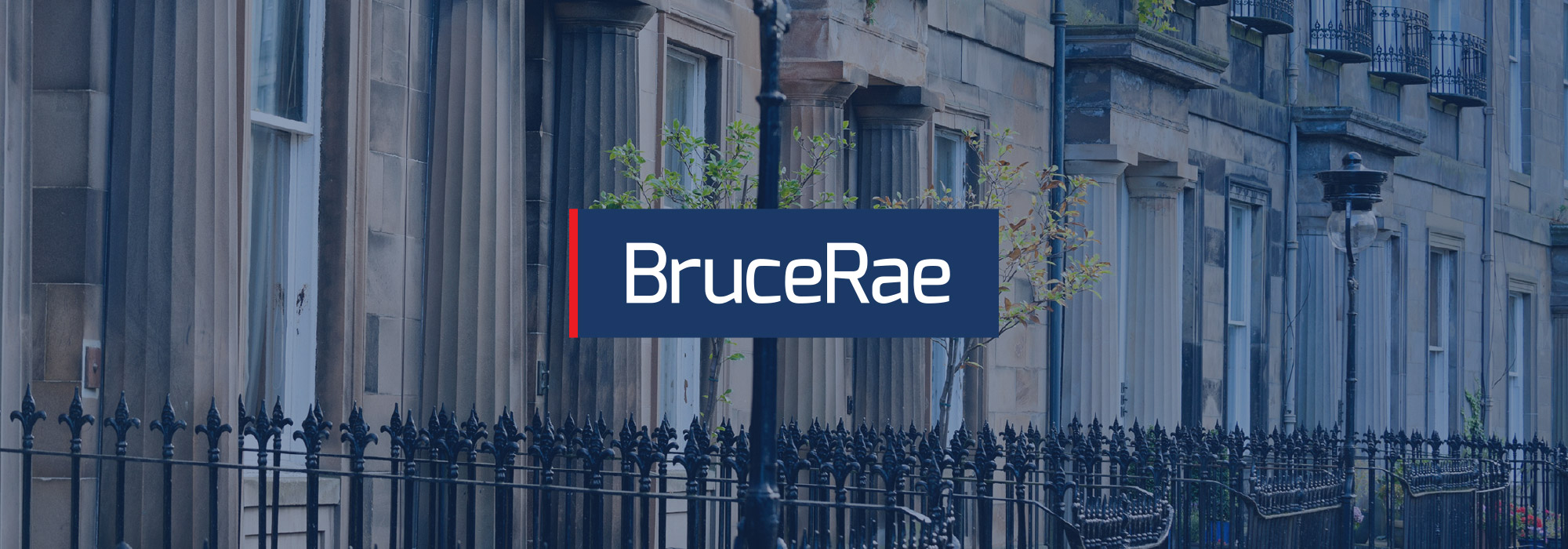
BruceRae has been prominent in the Edinburgh property market for nearly 25 years, but their existing logo was looking tired and dated, and no longer reflected the excellent service they provide - it was time to invest in a rebrand.
We used a modern typeface with 'just enough' character and subtly adjusted their existing brand colours. The dark blue conveying reliability and the pop of red ensuring they stand out in print (and on grey Edinburgh days!). The new logo is quietly confident, elegantly understated and inspires trust - it means BruceRae can face the future with confidence.
BruceRae's evolved logo retains the company's heritage while appearing relevant and professional.
Ben
Luminous Creative
Inspiring trust
BruceRae has strong links with the expat Scottish community in Hong Kong, managing their properties in Edinburgh. They regularly sponsor events attended by Scots in Hong Kong and as a result of the rebrand, their new logo now sits comfortably next to multi-national fellow supporters HSBC, KPMG and Cathay Pacific.
Explore more of
Our Work